Saba Ghani
Email address
moc.liamg@abashtiwngisedWeb Portfolio
www.sabaghani.comBiography
Hello! Nice to meet you,
I’m a young passionate multidisciplinary designer who is striving to make a change in the design industry. My inspiration is in the small details around my day to day life. I enjoy taking a simple thought and creating a big idea. I like working with design challenges that push me out of my comfort zone. I'm looking forward to taking the next step into my career. I am excited to see what the creative industry has to offer.
Brand Design | Interaction | Data Visualisation | Generative Design
Portfolio
Stressed Times
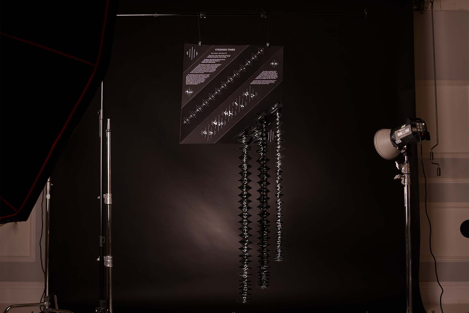
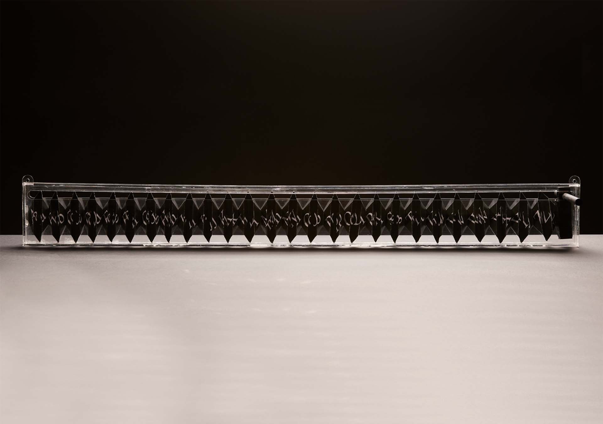
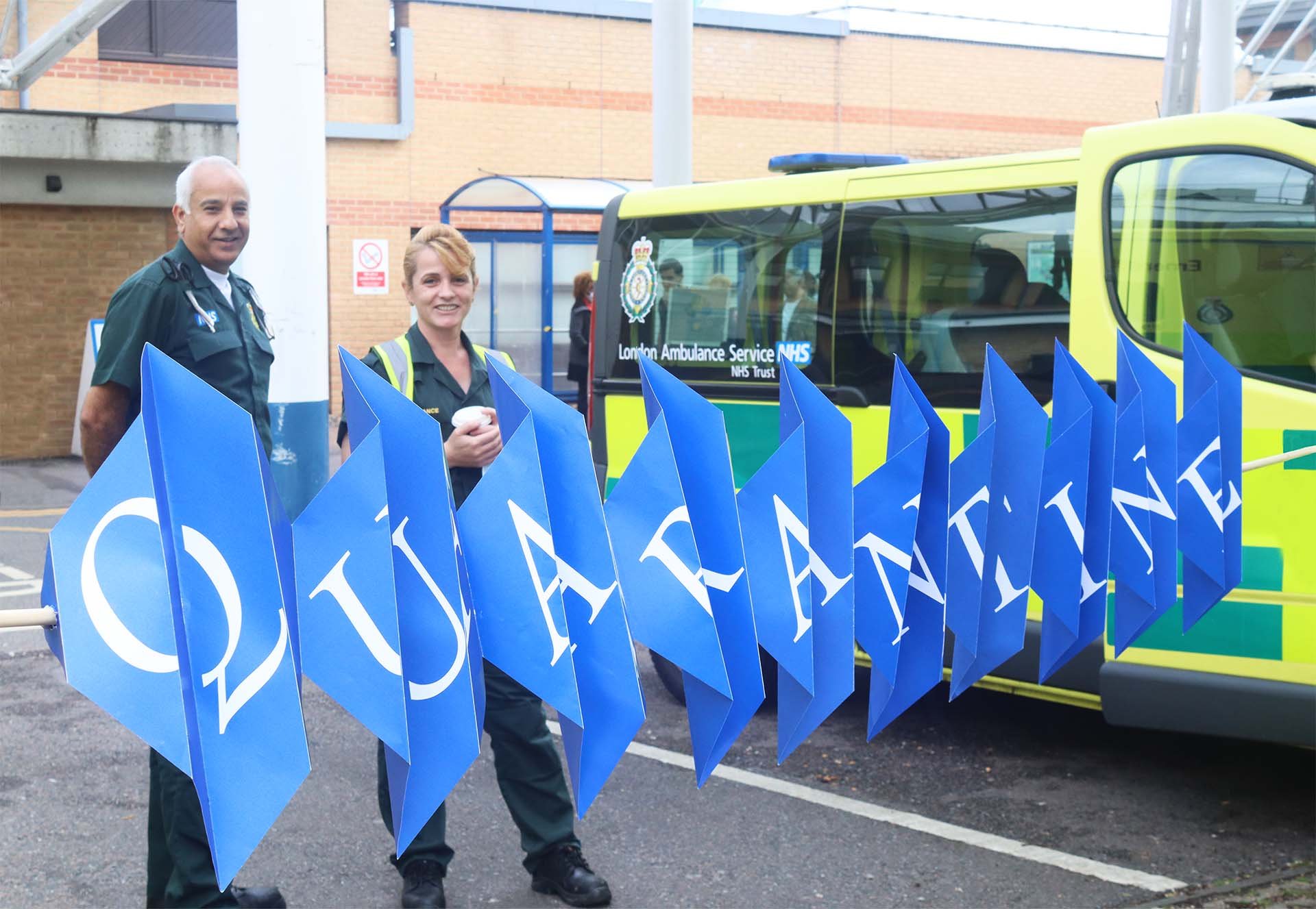
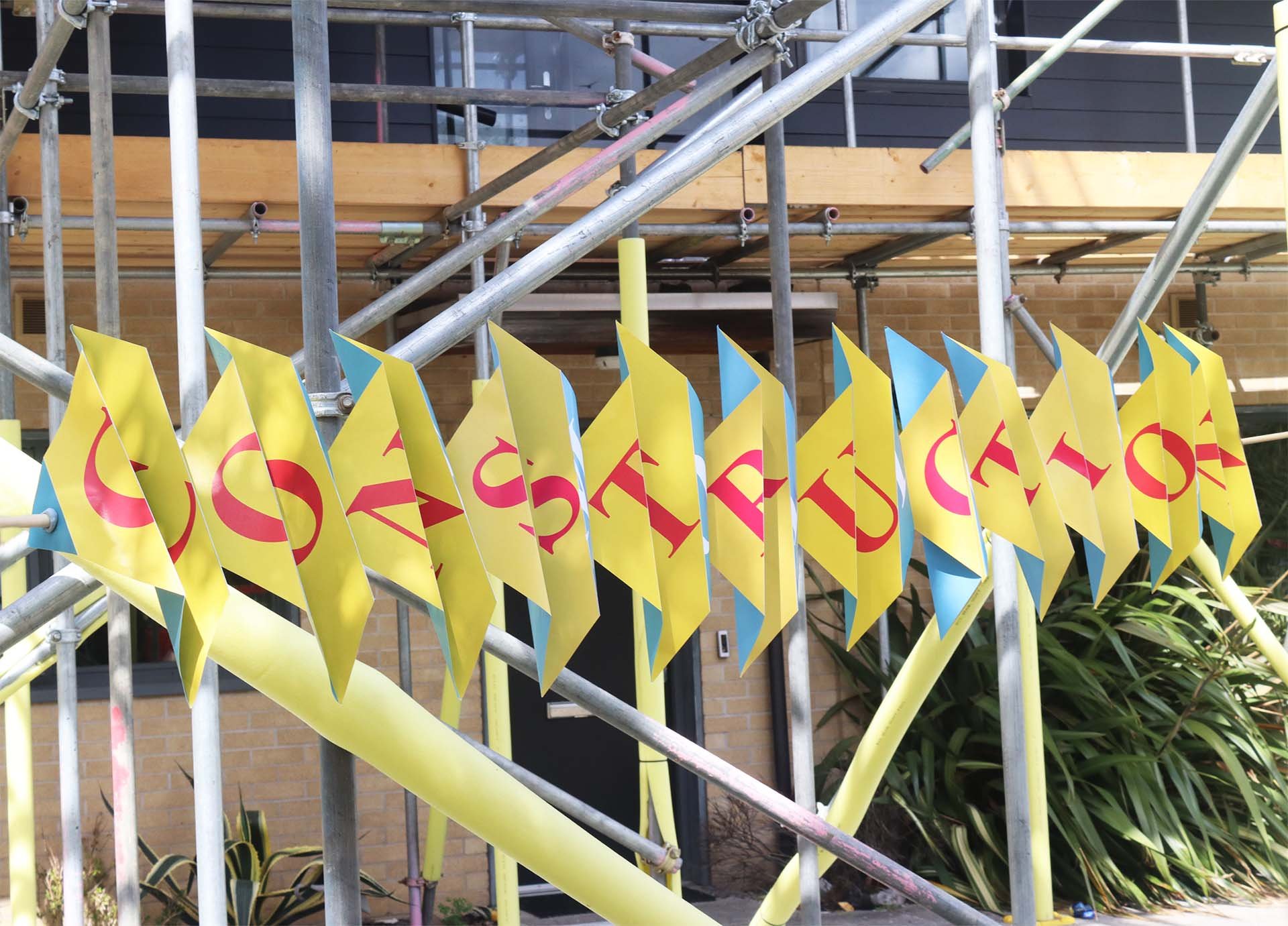
Stressed Times is a paper-engineered typeface which has been manipulated from the typeface “Times New Roman”. This type is a fun, playful and modern twist to Times New Roman. The inspiration for this typeface was from a single folded sheet of paper. Through the exploration of paper craft, the purpose of this typeface was to create a statement through three dimensional folds of paper, it reveals type which can be read from different angles.
The folds of the paper are a representation of stress, and how stress can fluctuate, i.e., the font showcases this fluctuation using size and directions. It allows users to be able to read more than one word/phase at a time due to the perspective of the type.
Visualising Your Space
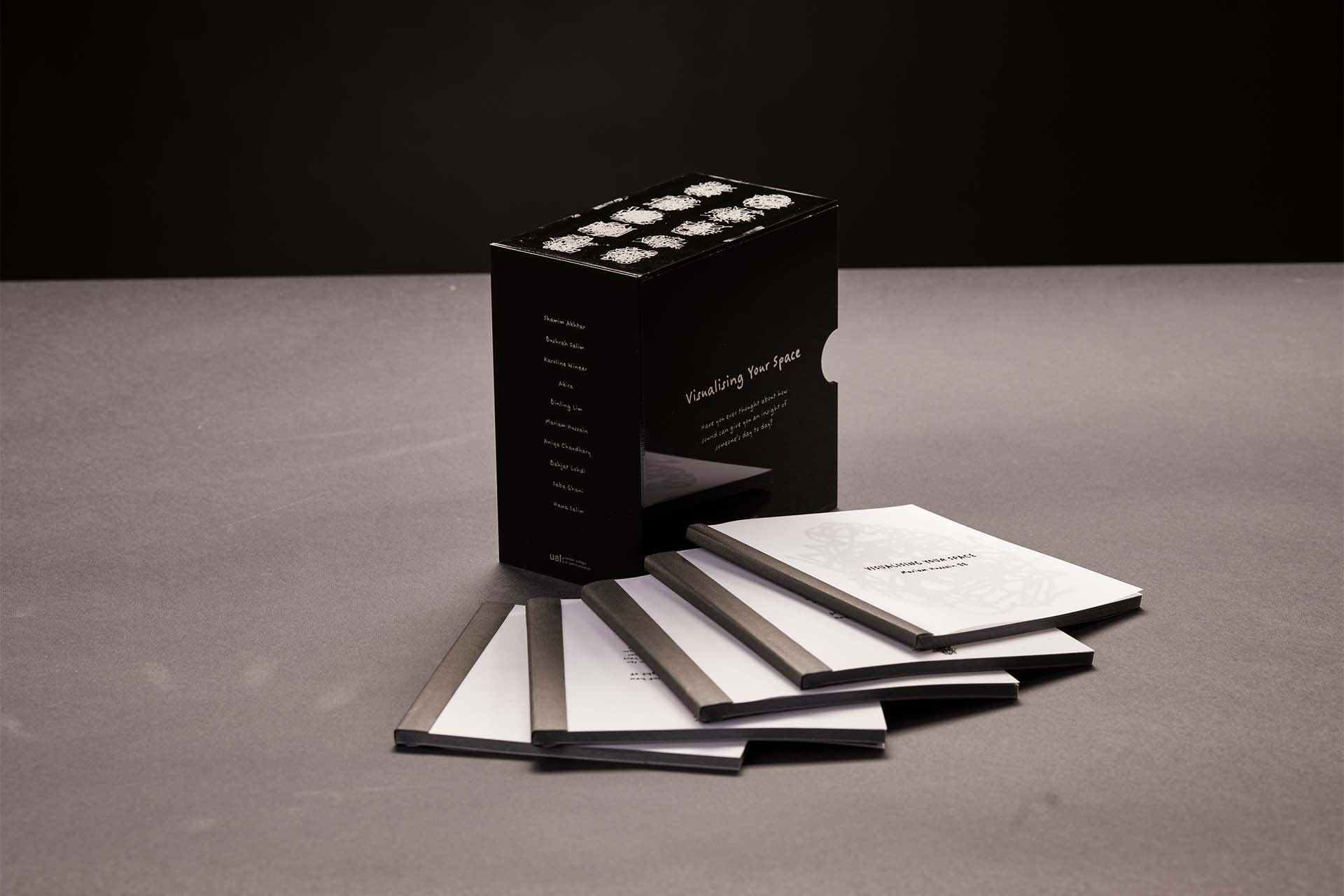
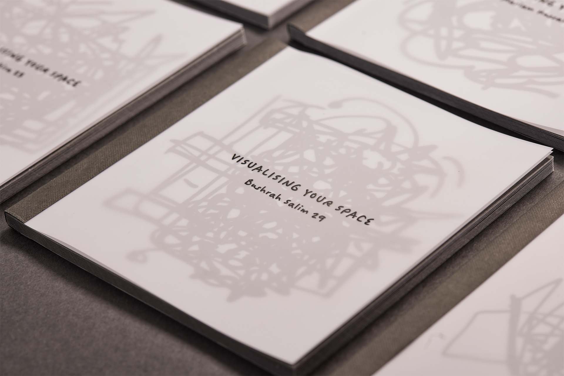
Visualising Your Space is a 10-book set that explores sounds generated from ten personal objects (chosen at random) that have been dropped from a height by 10 different people to create visual illustrations. As you flick through the book you will see a stop motion of each falling object giving the sound an image.
Jumma Juice
During my DPS year I had the opportunity to work with an international client to design a brand identity for Time Store (a grocery store based in Pakistan, Bahawalpur).
From my trip to Pakistan in 2021, I noticed a few problems the brand was having since opening their fresh produce section. I wanted to find a creative hypothetical brand design strategy for their fresh produce wastage problems. They were experiencing a loss as they were throwing away perfectly good fresh produce. I created an endorsed brand ‘Jumma Juice’ that would help reduce their wastage, advertise the Time Store fresh produce section, and help them to become more of a sustainable, low waste brand.

