Emma Shore
Email address
moc.liamg@erohs.j.ammeWeb Portfolio
emmashore.cargo.siteBiography
Hi, I'm Emma! A Graphic Designer with a particular interest in typography and hand lettering. Since working as a sign painter, I find myself continually inspired by type, typography and its environment. My projects draw from these sources of inspiration and aim to explore, test and question this relationship between type and its surroundings. In order to develop these narratives, I work both digitally and in print-based media to create appropriate design solutions.
Portfolio
AZ09: A Journey Through Type
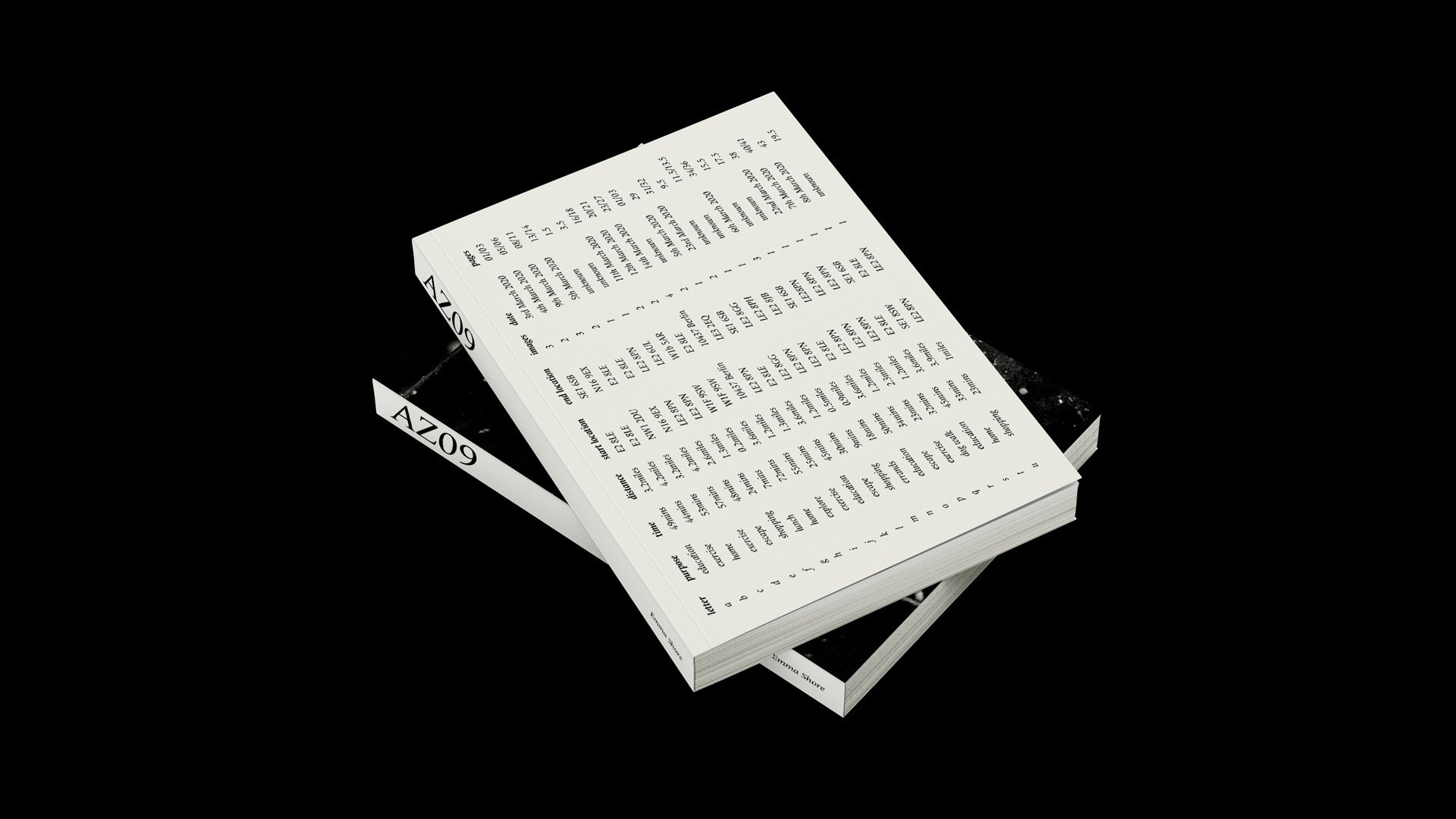
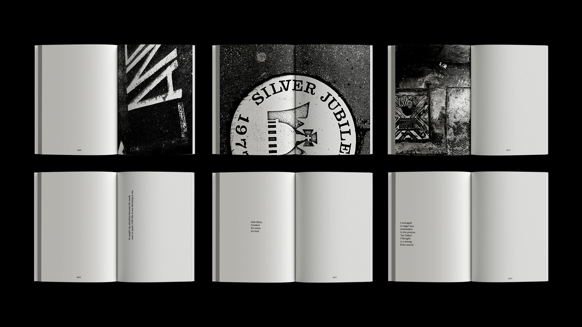
AZ09: a journey through type, offers an alternative way to experience and undertake our daily journeys. Type is a fundamental tool, used not only to inform, but also to build narratives. A journey, simply, is a combination of; time, distance, purpose and location. However, when considered laterally, a journey can be seen as a transformative period of time.
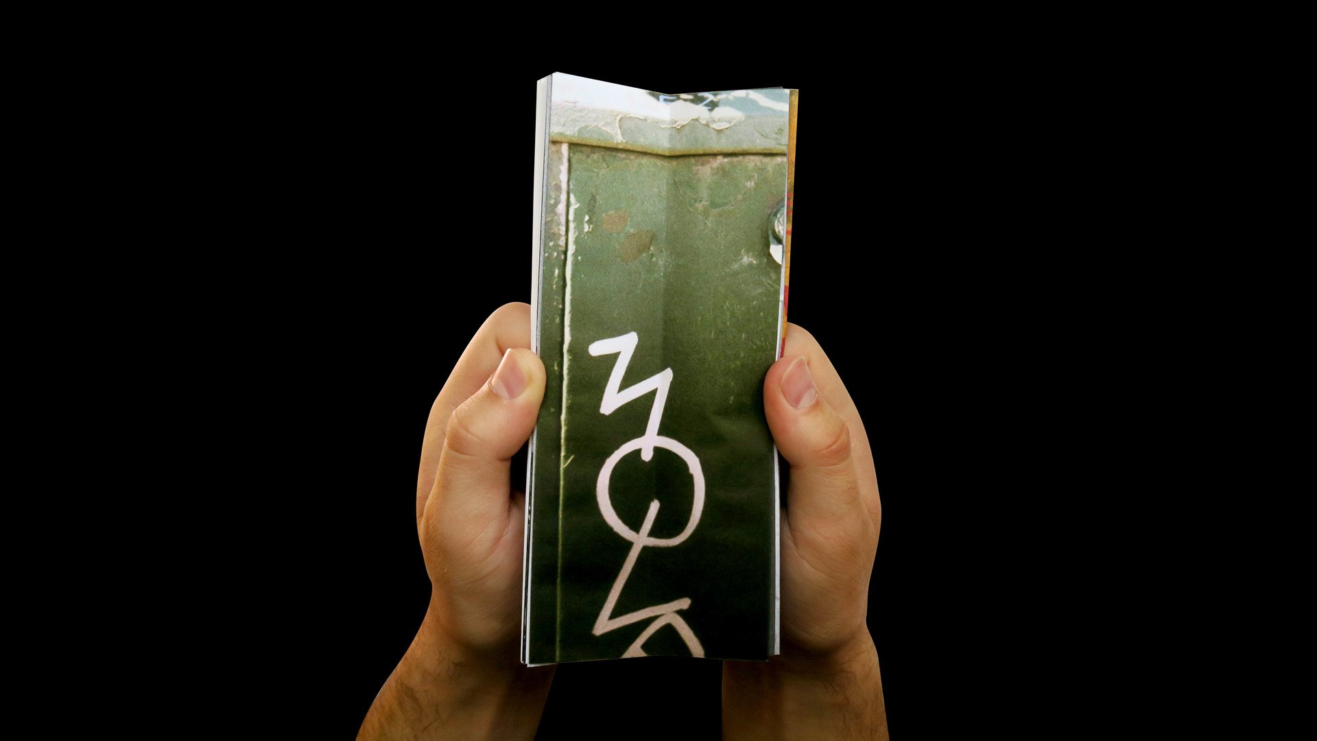
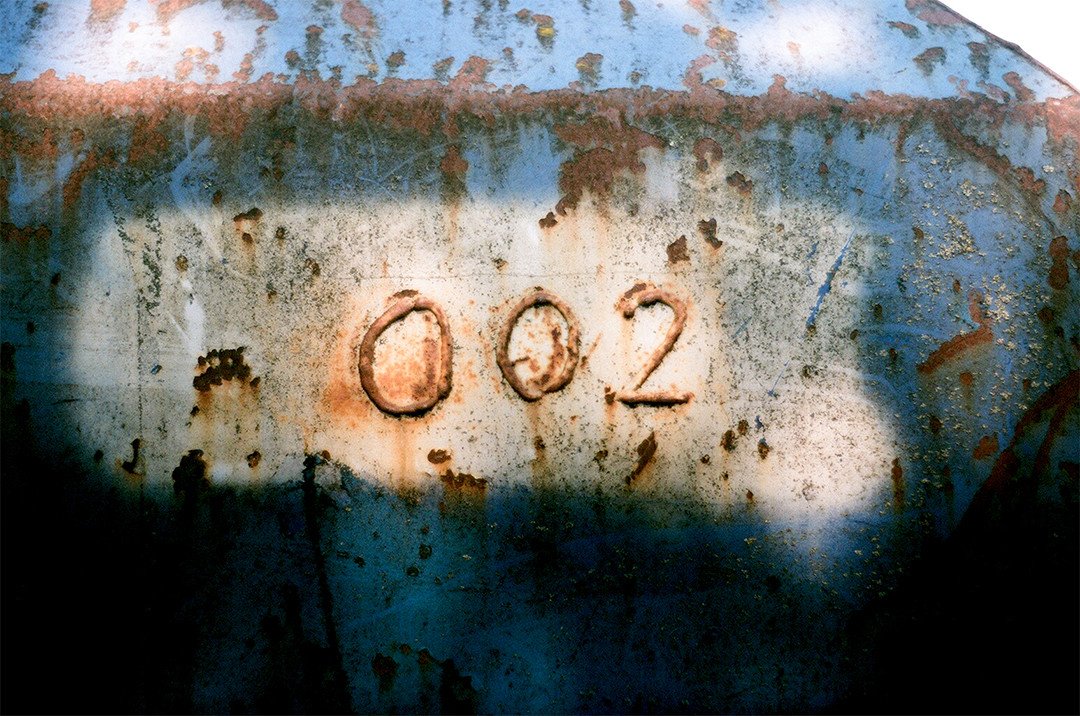
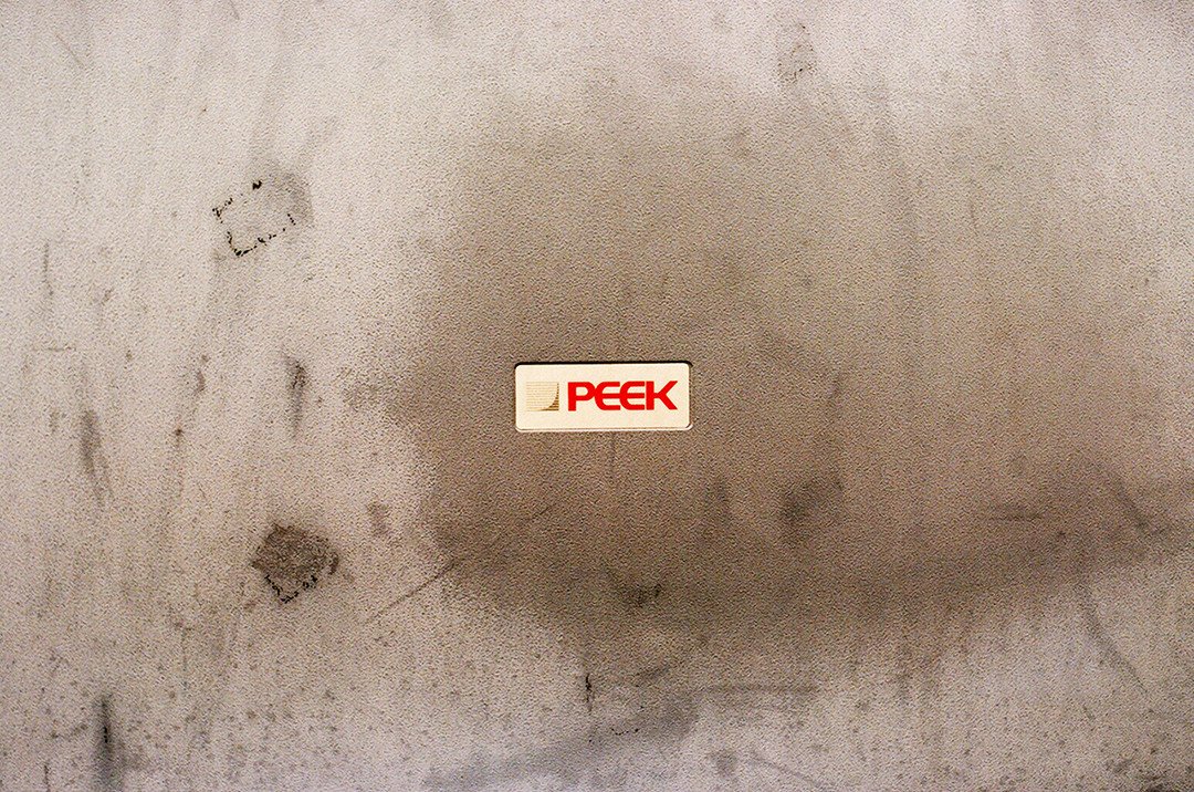
Over 36 days, A-Z and 0-9 were collected through notes and film photography. Two versions of this book were made, one with image and one with text, however both are intrinsically linked via composition and format. The editorial’s content as well as physicality embodies the experience of living through a crisis.
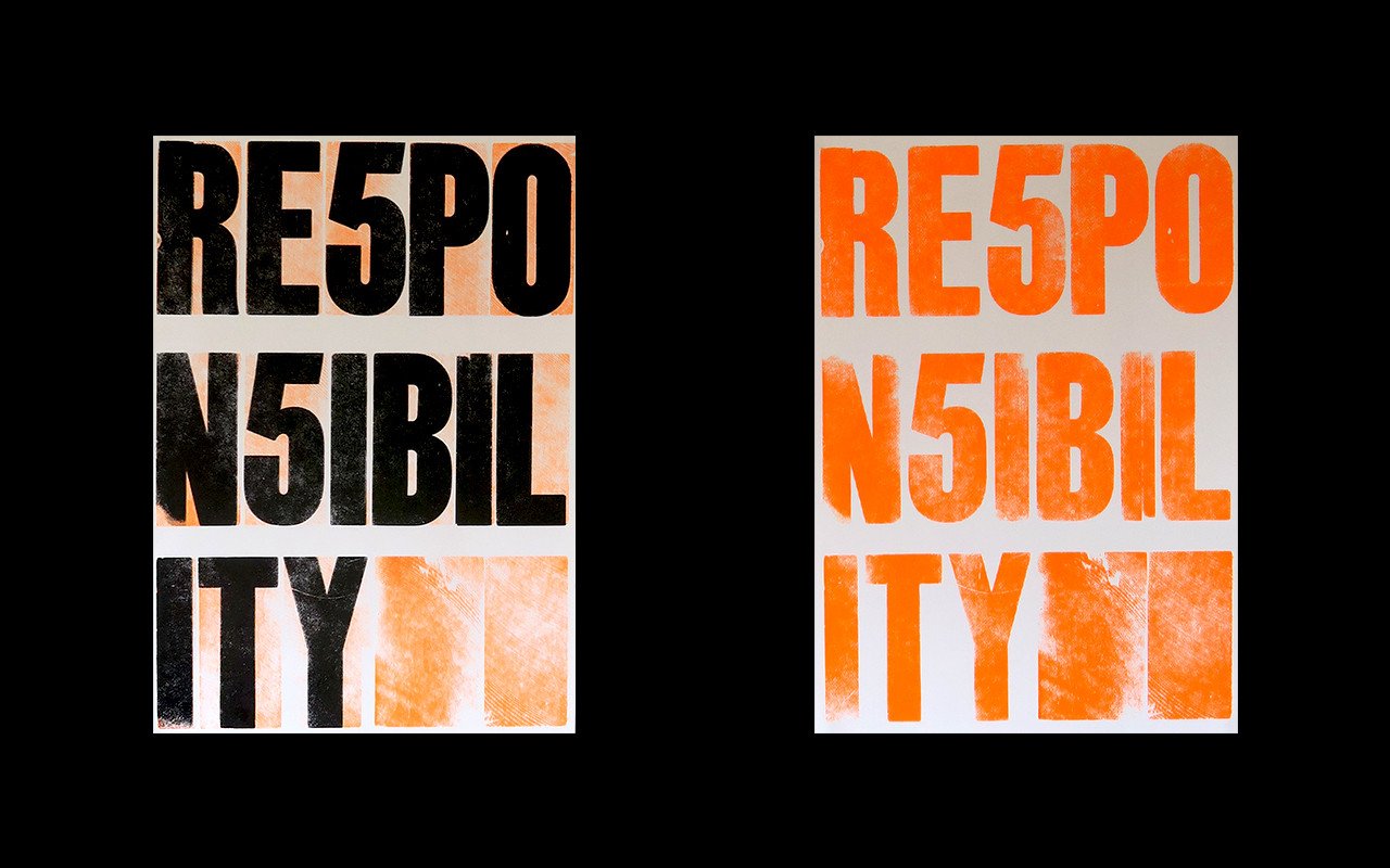
Thesis: Responsibility
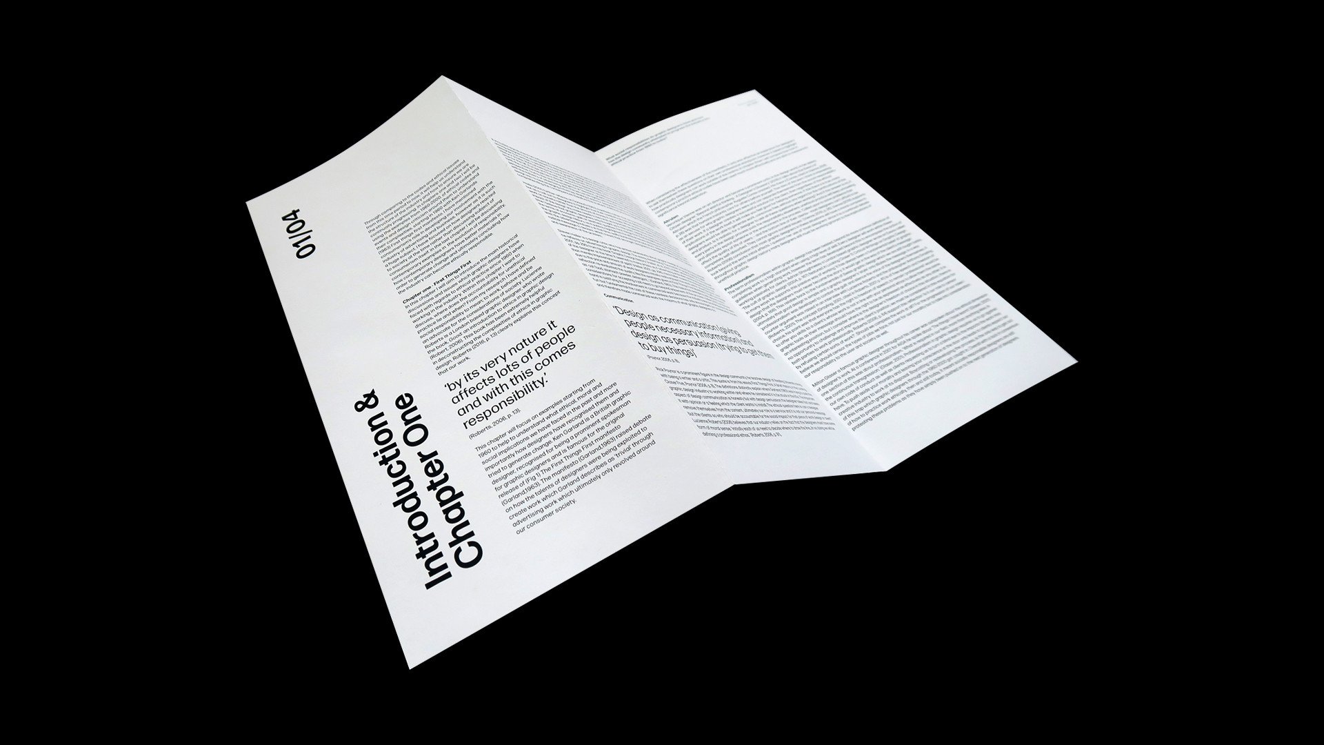
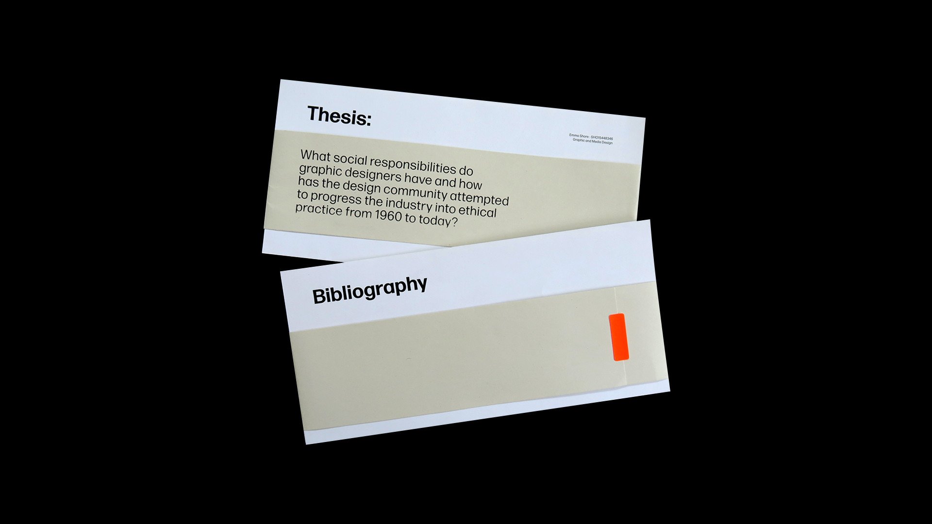
The research for my thesis was focused on the ethical responsibilities of a graphic designer. This idea came directly from my work. While tackling briefs I would constantly consider “what kind of graphic designer do I want to be?” My aim was to investigate how designers maintain their principles while having to work in corporate and commercial environments, an ever present struggle in our industry. In my thesis I discuss and compare many key figures in graphic design, that have tried to remain ethically responsible. To hold my thesis, I designed this series of folding posters including a letterpress print. The intent of these posters is to act as a reminder of ethical behaviour which can easily be overlooked.
E2 Living
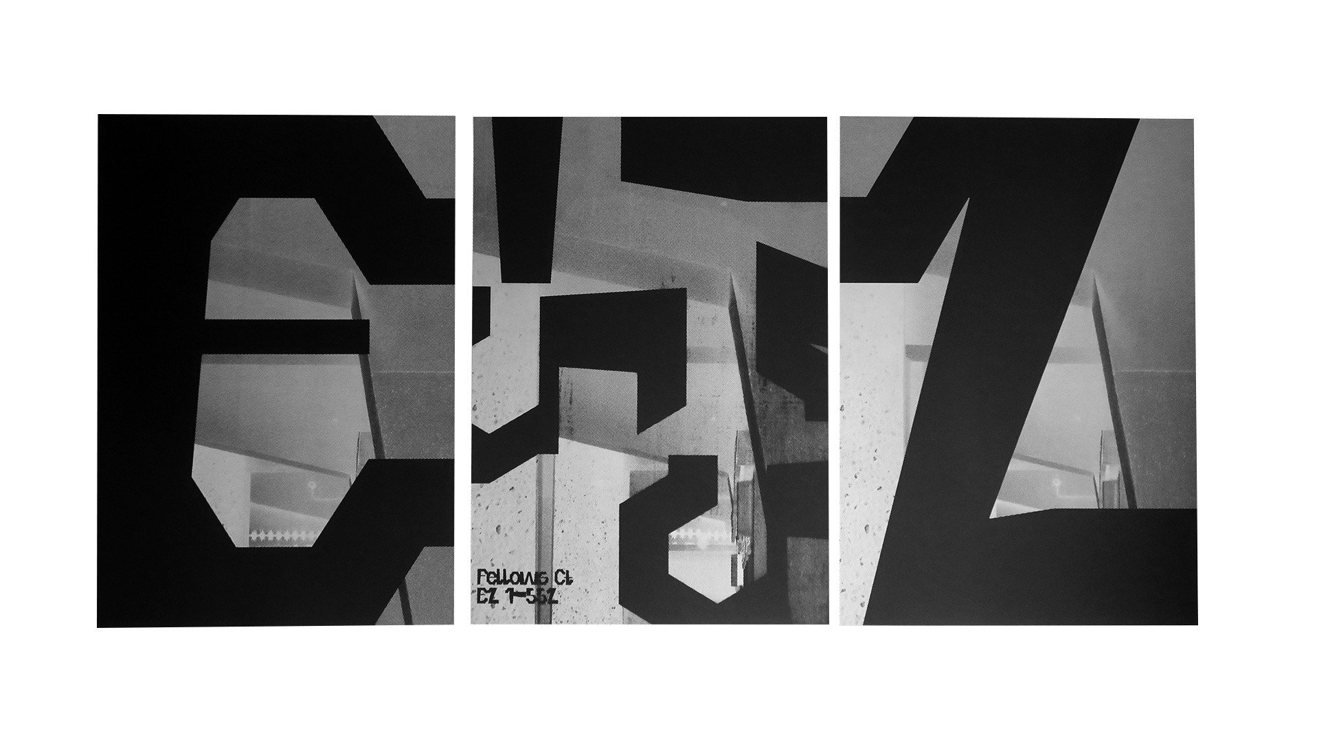
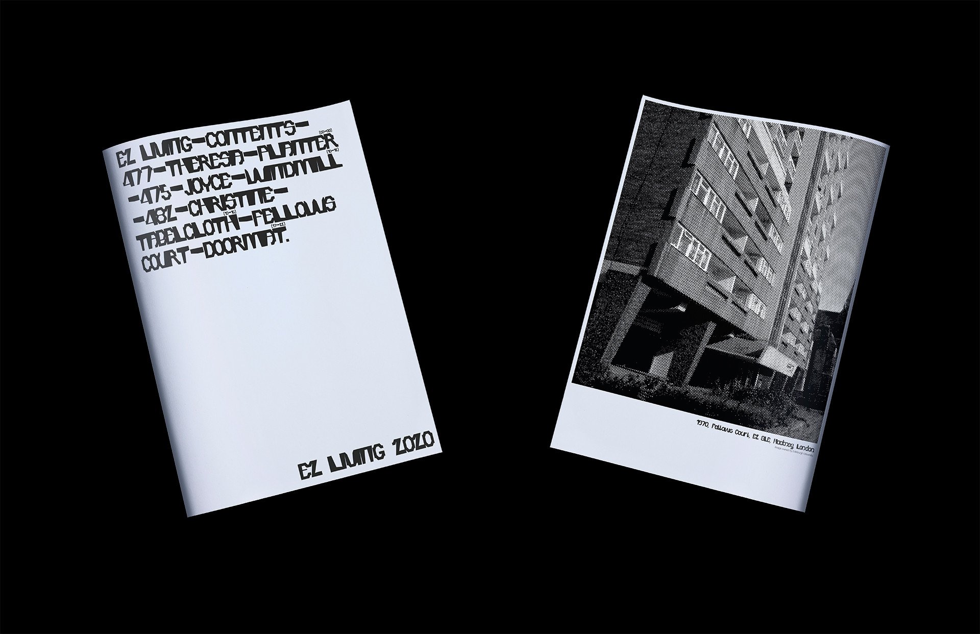
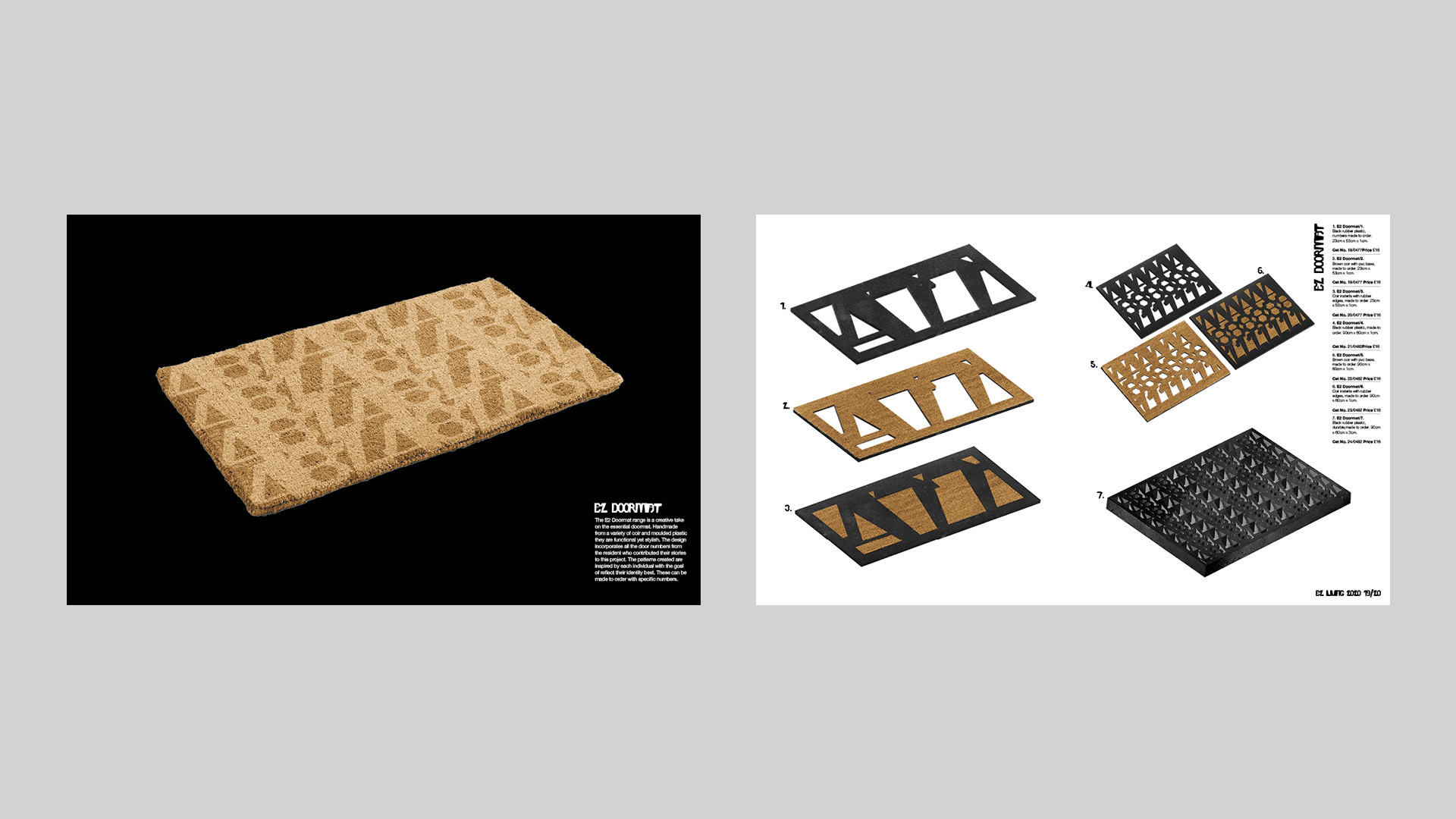
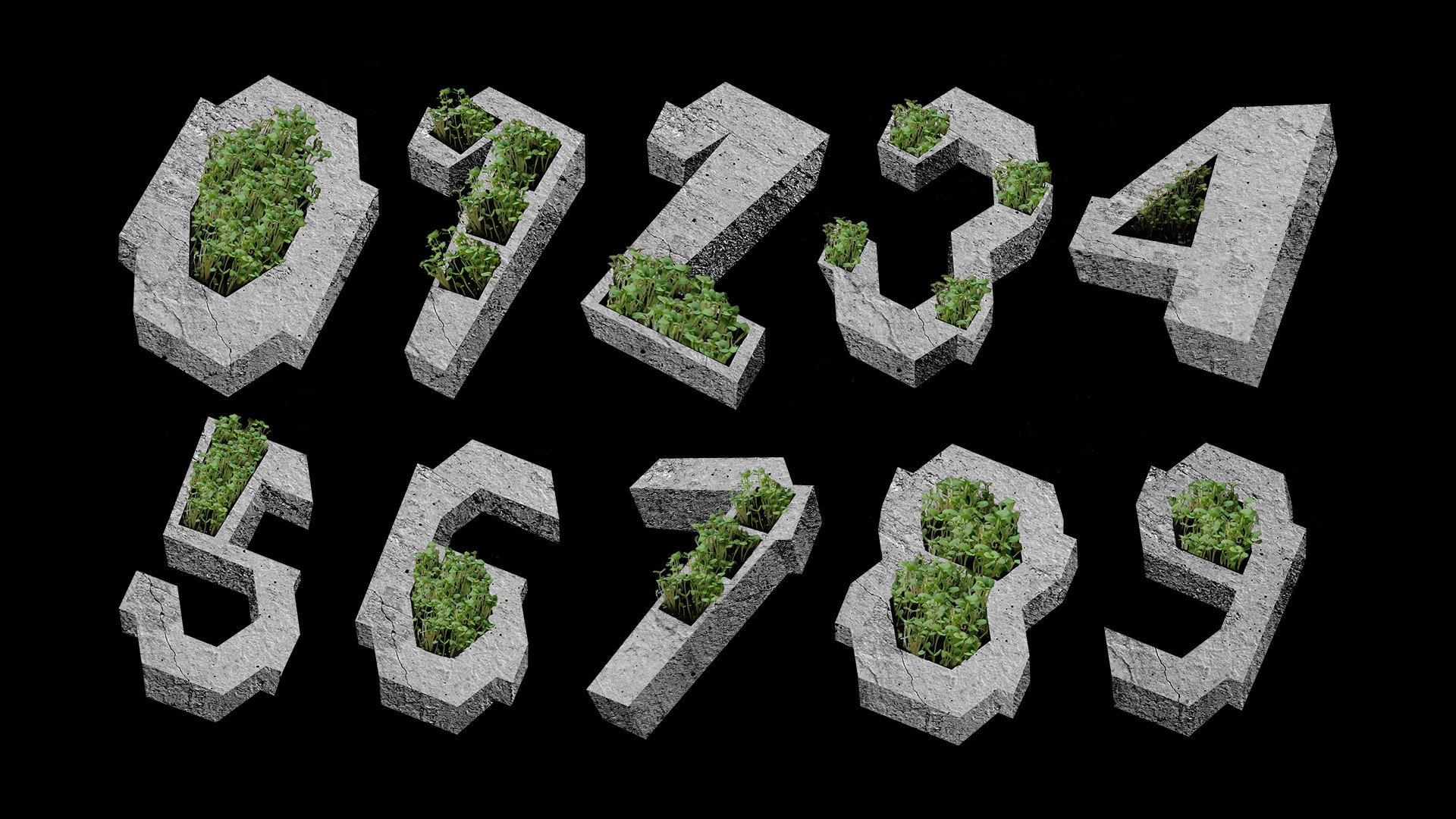
This project aimed to highlight how materials could emphasise meanings from text. Using my neighbours’ door numbers and relevant materials I created a bespoke home range in order to demonstrate their individual identities. To unite the items, I designed a catalogue which incorporates the typeface ‘E2’. This typeface was inspired by the council estate that I lived in during my final year. The key features of this design reference the structural elements of the building. Together the products, the catalogue and typeface highlight the relationship between the residents and the estate itself.
