Daniel Griffiths
Biography
Hi, my name is Dan Griffiths and I am a designer based in both Bristol and London. Through my journey of education and work, I have developed my skills in brand and identity. My body of work often touches upon social design and how my skills can have positive changes.
My work includes photography, print and a variety of digital mediums. I try and incorporate a variety of mediums in my projects to help open up all the potential directions. Looking forward, my goals are to further explore social design through brand identity. I find great pleasure in the journey of brand and identity, seeing projects take on a life of their own.
Thank you for looking.
Portfolio
Journey to Eden
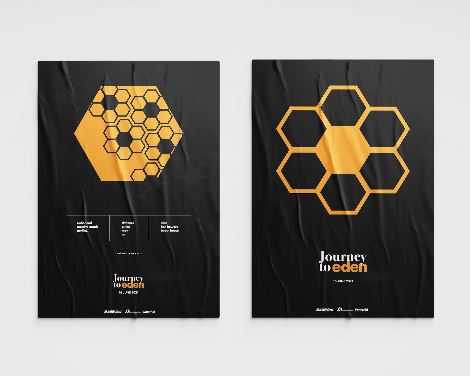
Journey to Eden is a rebrand of EDEN SESSIONS. The festival is held annually during the summer in the grounds of the EDEN Project. The festival is a yearly celebration of the EDEN project.
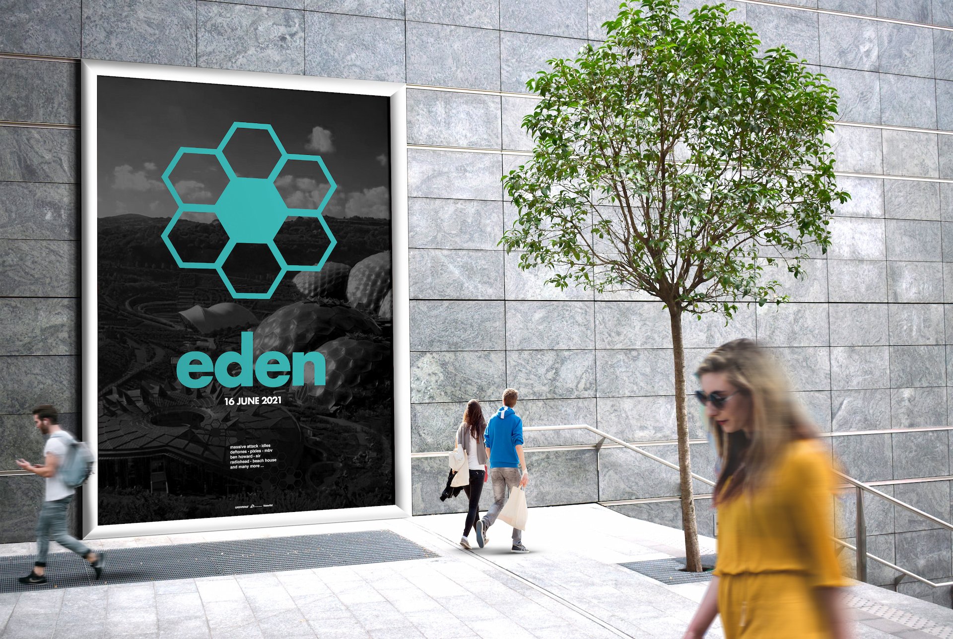
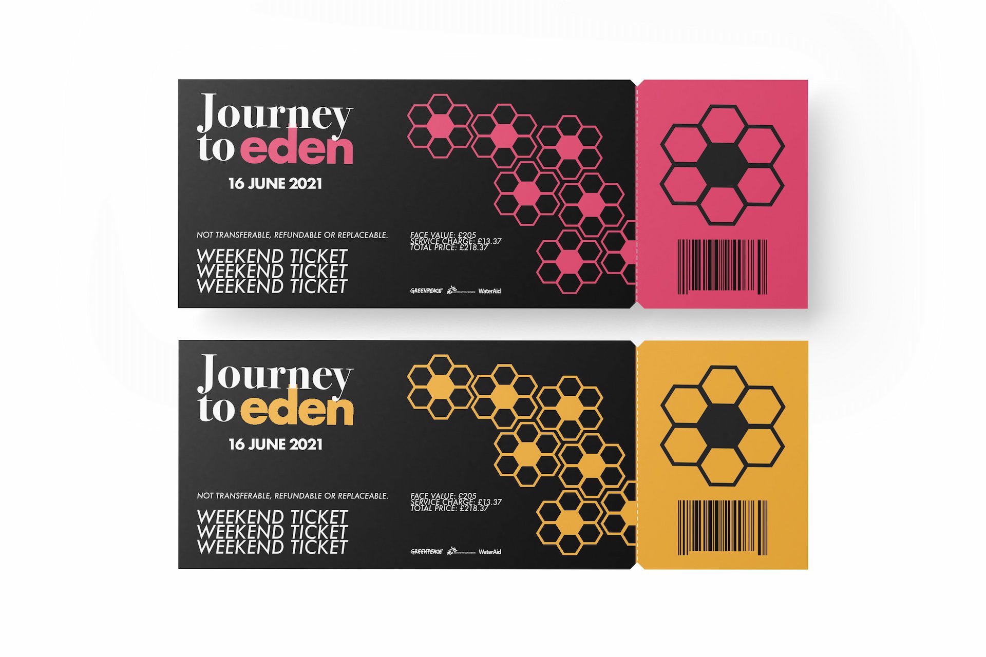
My rebrand aims to better highlight the link between nature and science. The main theme of the festival is the recurring hexagon, inspired by the geometric shapes of the EDEN project dome. The hexagon has been re-imagined as a petal, further reflecting the balance of humanity and nature.
Understanding nature, improving our carbon footprint and remembering the importance of conserving our planet is at the heart of the rebrand. This is mirrored in the decision to change the festival name. ‘Journey to Eden' better encapsulates the essence of this journey. The heart of this new development is the EDEN Project. As in life, the journey is just as important as the final destination.

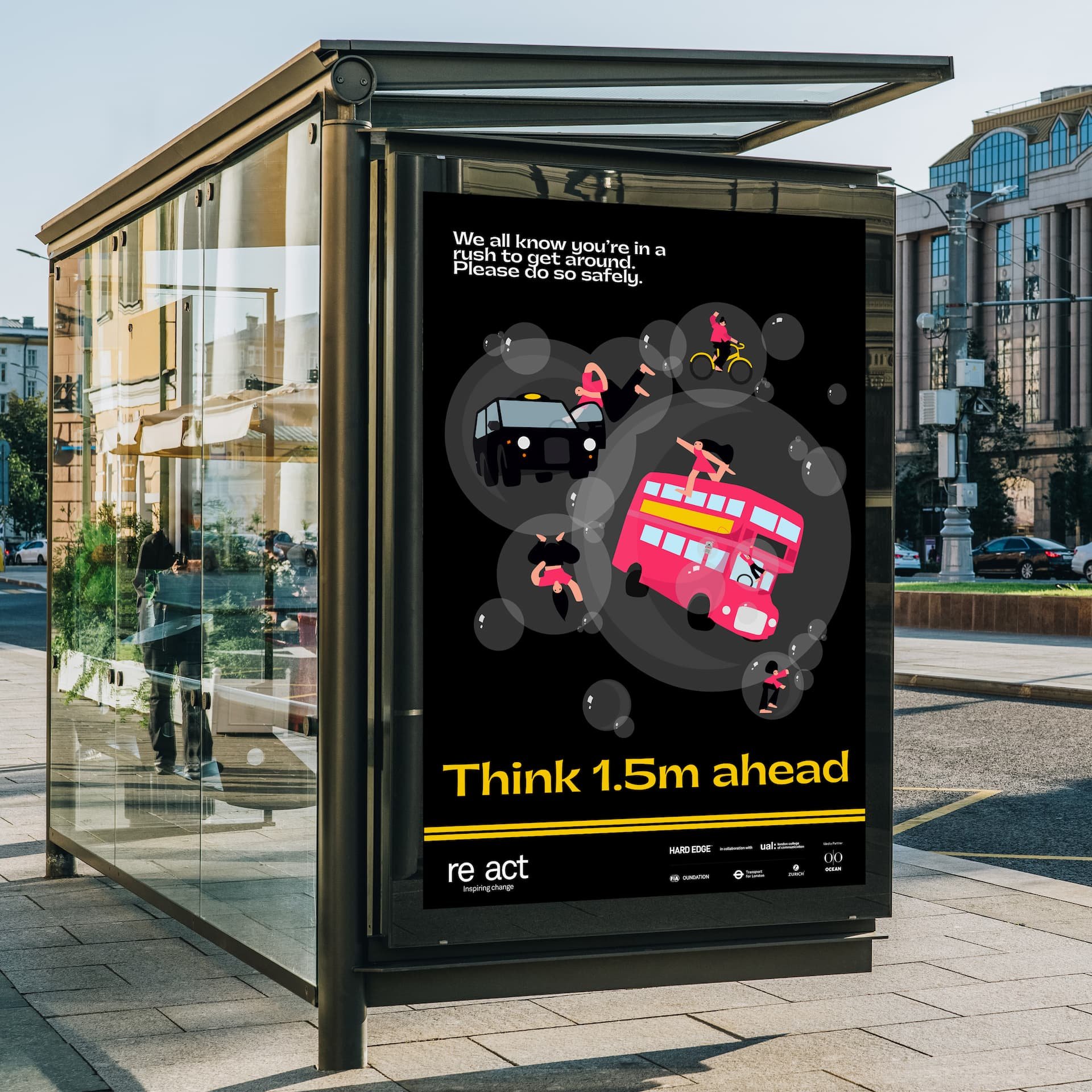
Think 1.5M ahead
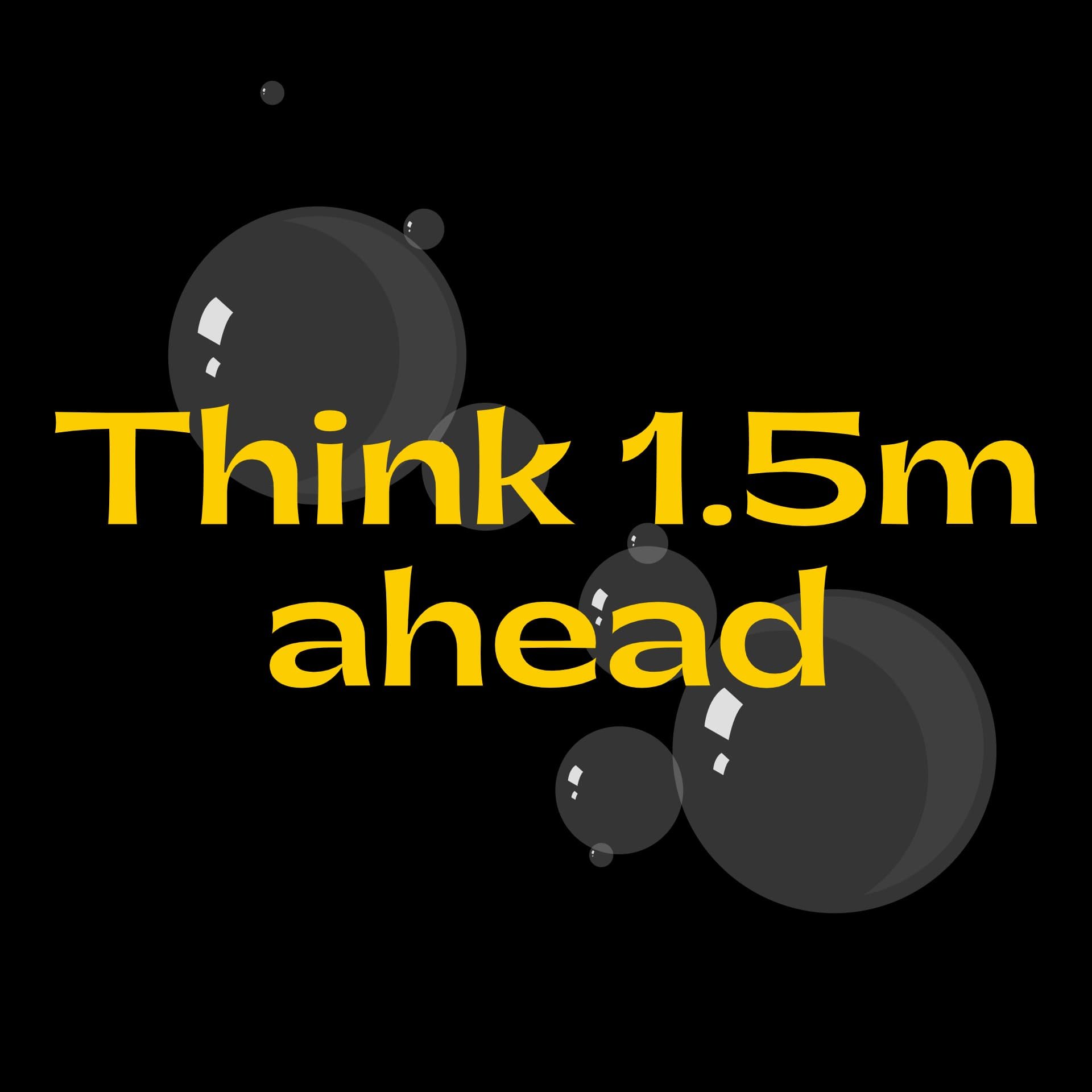
The RE:ACT project was a live brief aiming to raise awareness and increase the understanding of shared responsibility between VRUs (vulnerable road users) and vehicle drivers. VRUs made up half the fatalities reported by police authorities across the UK. With this information, we started to look at visual communication and the language and tone of our project.
In our research, we found 1.5m is the overtake distance the highway code recommends as safe practice on the roads. We took the literal idea of 1.5m as a distance and combined it with the metaphorical message of thinking ahead of each journey. The combination of both reflects the importance of how individual responsibility helps the overall safety of VRUs and vehicle road users.
Each character represents a road user. We chose to target both VRUs and vehicle drivers. We felt that to bring a collective want for shared responsibility, we needed to speak to all road users. The visual communication of the poster highlights the importance of inclusivity, effectively bridging the gap between all road users. By targeting them all, we help to make the roads a safer place for everyone.
POP BRIXTON
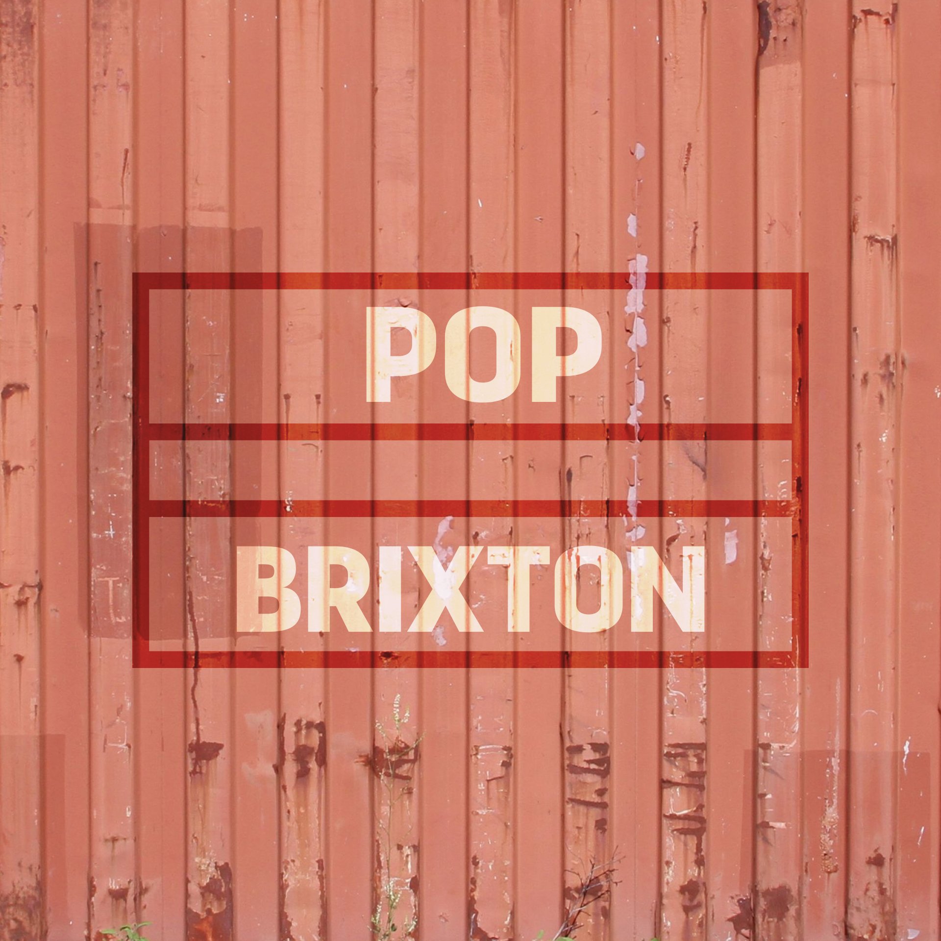
POP BRIXTON is a temporary project that aims to take disused land and convert it into a usable community space for local, independent businesses. The aim of the project is to bring prosperity to local communities through enterprise, while also investing time and skills into charitable projects, providing free space for community events of every kind. A hub for the community.
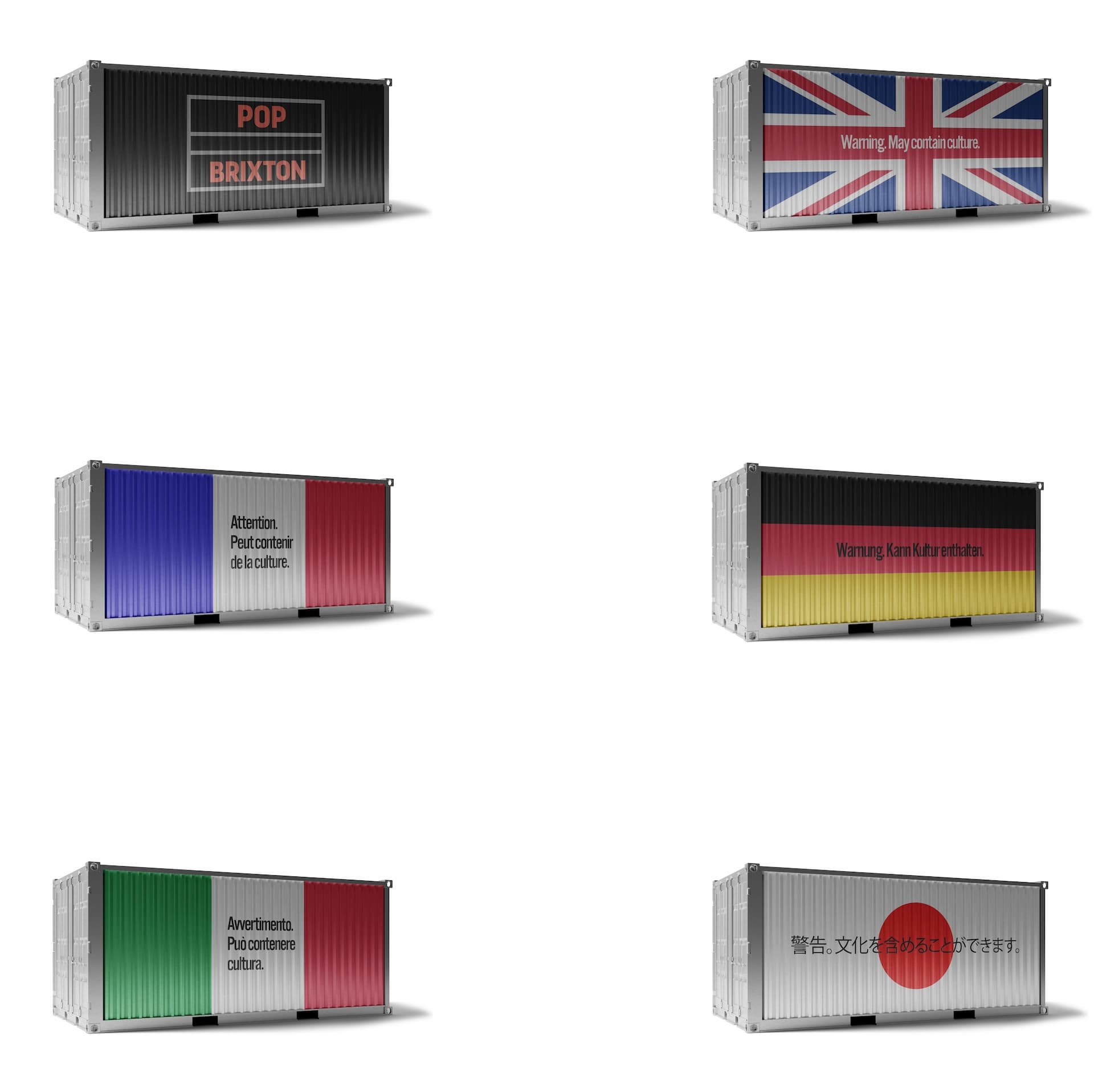
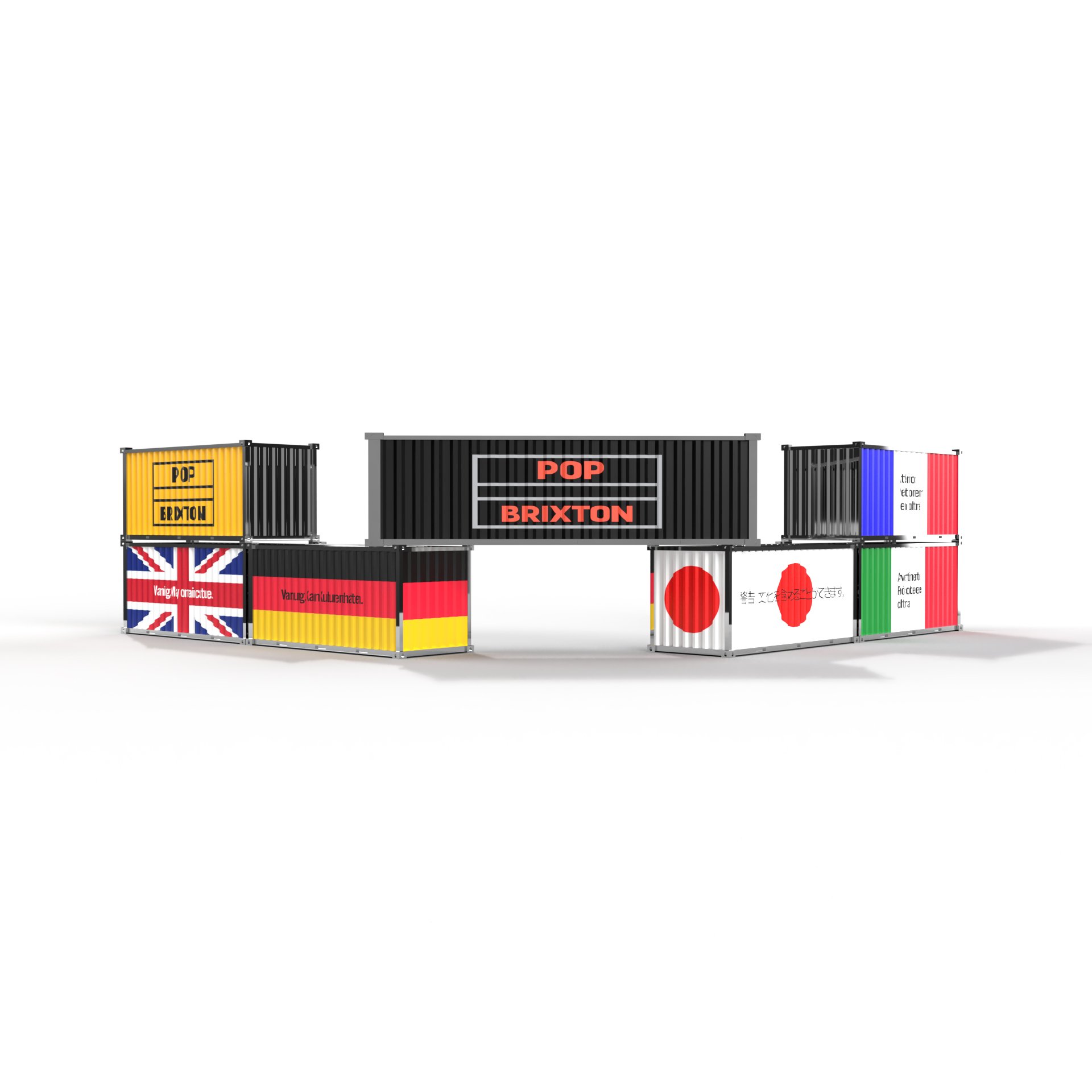
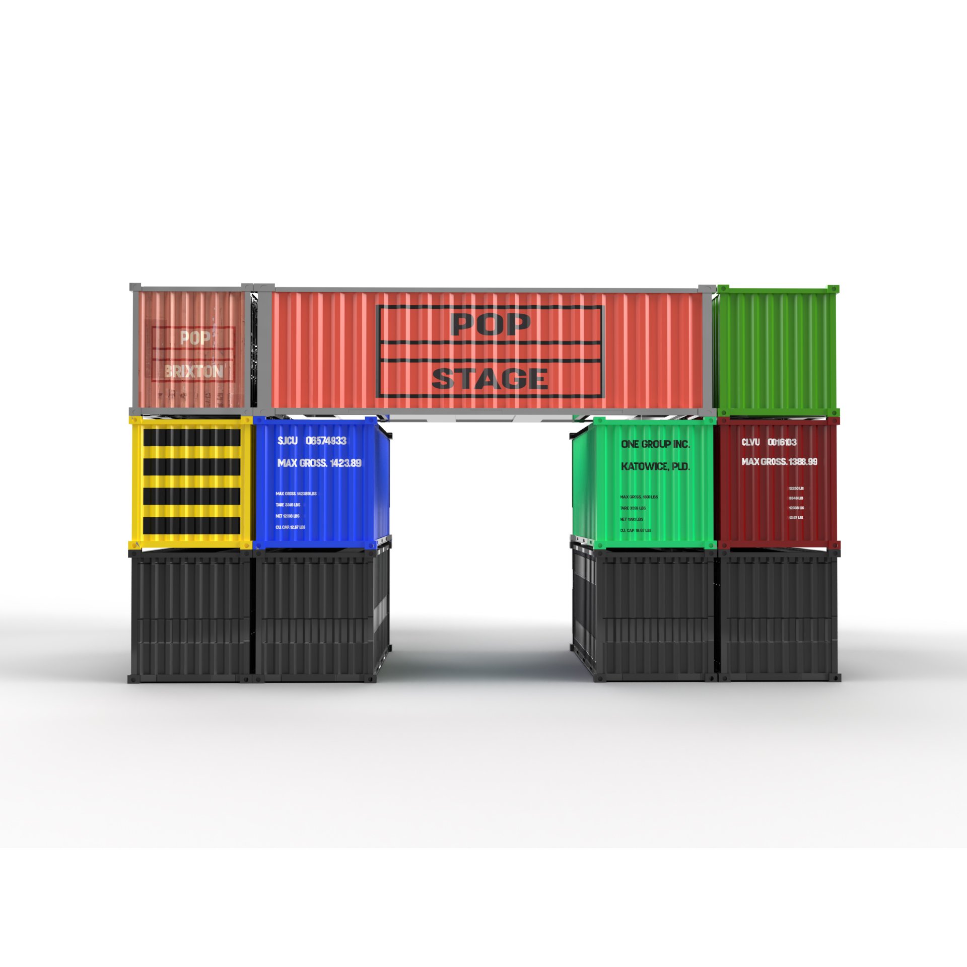
The rebrand focuses on the importance of inclusion and celebrating diversity among the international community in London. From my visits to POP BRIXTON, I felt inspired by the variety of visual language on each container. I felt the containers were the perfect objects to distribute my message for POP BRIXTON.
I gathered data on the highest nationalities visiting London the most outside of the UK. With these figures, I had a good understanding of the demographic visiting London the most frequently. I chose to incorporate the flags of these countries. The flags appear on the containers, each with the same message - 'Warning. May contain culture'. this is a tongue-in-cheek approach to grab the attendee's attention before they enter the site. It's a subtle message that invites the viewer to further question the meaning within the structure made up of containers. The variety of languages reflect the high levels of tourism and the ethnic diversity of London. In a world that is separated more than ever, the rebrand is an attempt to bring communities together. My rebrand wants to push the collective spirit further, bringing the local community and those beyond together to widen the understanding of cultures and beliefs. It's a celebration of diversity, and the melting pot that is London.
